ASSETS

These resources will help create an impactful campaign. We have designed this system to unite local campaigns under one global brand identity and connect people in one cohesive movement.
These resources will help create an impactful campaign. We have designed this system to unite local campaigns under one global brand identity and connect people in one cohesive movement.
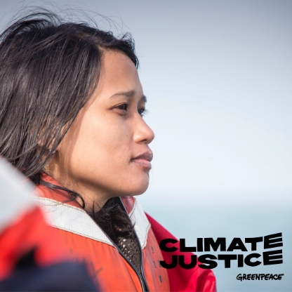
Present the campaign logo clearly and consistently.
Feel free to use any of the two main logos.
We have chosen six vibrant colours for this campaign to use across all assets. These colours can be used as full backgrounds, in banner combinations or within text when used on a simple white background.
RED SUNSET
#ED3F1D
R:237 G:63
B:29
YELLOW SUN
#F9D33C
R:249 G:211
B:60
GREEN GRASS
#39B54A
R:57 G:181
B:74
TURQUOISE SKY
#00C1FF
R:0 G:193
B:255
BLUE SEA
#0038A8
R:0 G:56
B:168
PINK FLOWER
#ED3F1D
R:255 G:146
B:244
When creating a Climate Justice campaign, the main typographic approach is to use fonts that are bold yet legible, that can convey powerful and moving messages to the public.
When creating the Climate Justice campaign, the main rule was to make sure to use readable fonts. Formanova Black is the primary font for headers and titles and Helvetica bold for texts. See usage HERE
CLIMATE
FORMANOVA BLACK
The primary font, to always be used in caps for headlines and key messaging across assets like campaign headlines or flyer messaging―it comes in just one weight.
Download FontJustice
Helvetica Neue bold
A universal font available in all languages, to be used for all body copy text, both in print and online. To separate texts and quotes feel free to use Helvetica Regular.
Download FontWhen creating a Climate Justice campaign, the main typographic approach is to use fonts that are bold yet legible, that can convey powerful and moving messages to the public.
Formanova Black is the primary font for headers and titles and Helvetica bold for texts.
The 7 core principles for climate change visual communication developed by Climate Visuals, based on international social research.
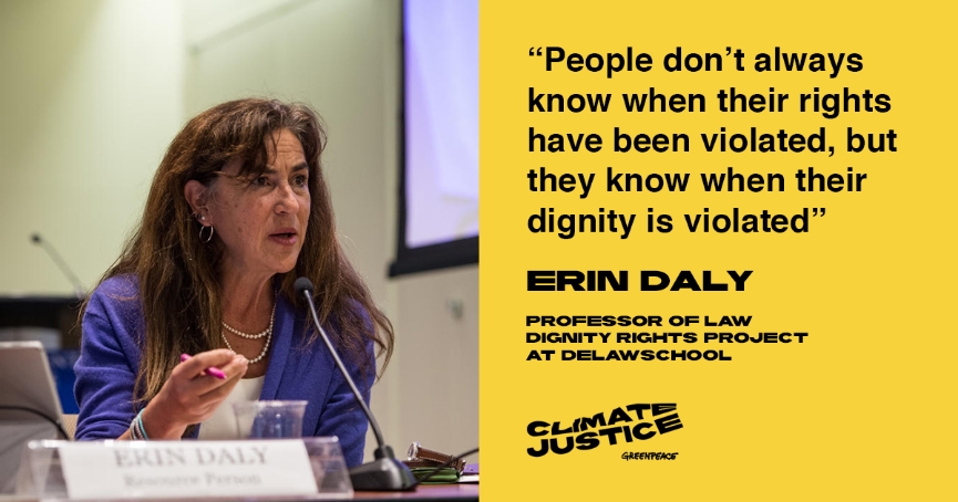
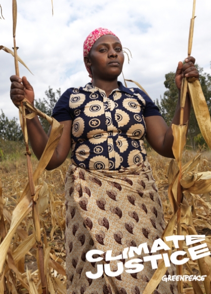
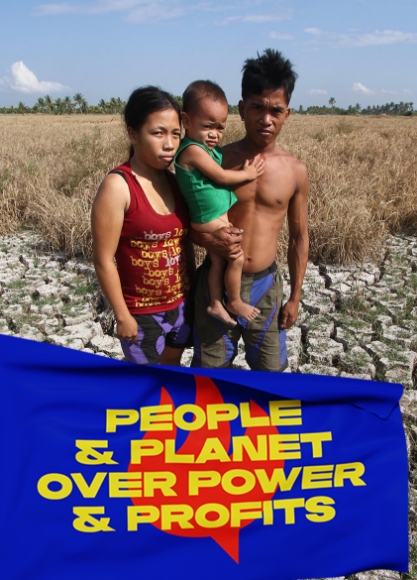
Media GalleryA person expressing an identifiable emotion is powerful. Climate Visuals organized a series of focus groups that favoured ‘authentic’ images over staged photographs, which they saw as gimmicky or even manipulative. Politicians – notoriously low on credibility and authenticity – attracted some of the lowest scores (in all three nations) in Climate Visuals’ survey as well.

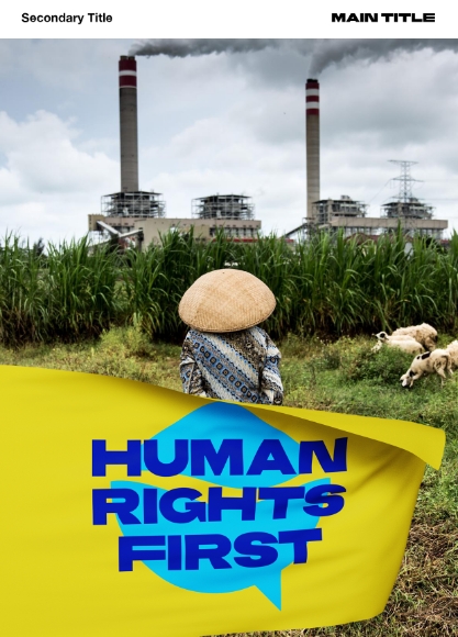
Images that participants could quickly and easily understand – such as smokestacks, deforestation, and polar bears on melting ice – tended to be positively rated in the Climate Visuals online survey (which captured rapid responses to images, rather than deeper debate). Familiar, ‘classic’ images may be especially useful for audiences with limited knowledge or interest in climate change, but they also prompted cynicism and fatigue in Climate Visuals discussion groups. They are effective ways of communicating to an audience that ‘this story is about climate change’. But is it a story they want to hear? Less familiar (and more thought-provoking) images can help tell a new story about climate change, and remake the visual representation of climate change in the public mind.
Climate Visuals found that people do not necessarily understand the links between climate change and their daily lives. Individual ‘causes’ of climate change (such as meat-eating) may not be recognised as such, and if they are, may provoke defensive reactions. If communicating the links between ‘problematic’ behaviours and climate change, it is best to show these behaviours at scale – e.g. a congested highway, rather than a single driver.
Climate Visuals survey participants in Germany, the United Kingdom and the United States were moved more by climate impacts – e.g. floods, and the destruction wrought by extreme weather – than by ‘causes’ or ‘solutions’. Images of climate impacts can prompt a desire to respond, but because they are emotionally powerful, they can also be overwhelming. Coupling images of climate impacts with a concrete behavioural ‘action’ for people to take can help overcome this.
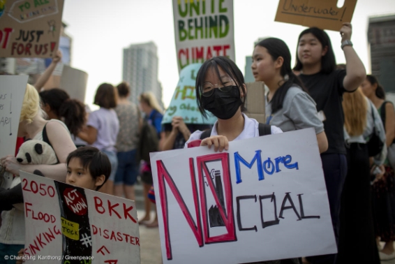
When images of localised climate impacts show an individual person or group of people, with identifiable emotions, they are likely to be most powerful. But there is a balance to be struck (as in verbal and written communication) between ocalising climate change (so that people realise the issue is relevant to them) and trivialising the issue (by not making clear enough links to the bigger picture).

Images that participants could quickly and easily understand – such as smokestacks, deforestation, and polar bears on melting ice – tended to be positively rated in the Climate Visuals online survey (which captured rapid responses to images, rather than deeper debate). Familiar, ‘classic’ images may be especially useful for audiences with limited knowledge or interest in climate change, but they also prompted cynicism and fatigue in Climate Visuals discussion groups. They are effective ways of communicating to an audience that ‘this story is about climate change’. But is it a story they want to hear? Less familiar (and more thought-provoking) images can help tell a new story about climate change, and remake the visual representation of climate change in the public mind.
Climate Visuals found that people do not necessarily understand the links between climate change and their daily lives. Individual ‘causes’ of climate change (such as meat-eating) may not be recognised as such, and if they are, may provoke defensive reactions. If communicating the links between ‘problematic’ behaviours and climate change, it is best to show these behaviours at scale – e.g. a congested highway, rather than a single driver.
Use these templates to create a strong campaign.